|
AjaxControlToolkit already has an
Accordion panel control packed with it. Refer here
to know more.
After the release of jquery library,
the clientside scripting has become very easy and faster. Since, the Accordion
panel functionality is all about expanding and collapsing an html element
(<DIV>/<P>) it can be easily implemented with jquery library. Moving
forward, we will see how to build the same control using jquery in an ASP.Net
page.
If you are new to jQuery, i recommend you to read the below FAQ’s to
have a quick understanding.
What is jQuery?
How to use it in ASP.Net Pages?
How to enable
jQuery intellisense in Visual Studio 2008?
How to use
jQuery intellisense in an external javascript file?
Read the below article, to know more
about jQuery library and its advantages,
Introduction to
jQuery in ASP.Net and 10 Advantages to Choose jQuery
Steps
1. Open Visual Studio 2008.
2. Create a new website project in your visual studio 2008 using C# as the language.
3. Now, we will first design our accordion panel using div tags. We will
use a DIV tag for header and another div tag for the content by making it closed
by default. Refer the below code,
<div class="Accordion">
<div id="header"
class="collapsePanelHeader">
<div id="dvHeaderText"
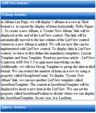
class="HeaderContent">ASP.Net Articles</div>
</div>
<div id="dvASPNET" class="Content"
style="display:none">
<!-- Your Content goes here
-->
</div>
<br />
<div id="Div2"
class="collapsePanelHeader">
<div id="Div3"
class="HeaderContent">Csharp Articles</div>
</div>
<div id="dvCSharp" class="Content"
style="display:none">
<!-- Your Content goes here
-->
</div>
<br />
<div id="Div7"
class="collapsePanelHeader">
<div id="Div8"
class="HeaderContent">jQuery Articles</div>
</div>
<div id="dvjQuery" class="Content"
style="display:none">
<!-- Your Content goes here
-->
</div>
</div>
In the above code, i have defined 3
panels which displays its header div visible (div with cssclass
collapsePanelHeader) and the content div collapsed (div with cssclass Content).
When i say collapsed it is nothing but making its display property as
none.
Below, you can find all the css class
used above.
<style>
/*CollapsiblePanel*/
.collapsePanelHeader
{
width:402px;
height:30px;
background-image:
url(images/bg-menu-main.png);
background-repeat:repeat-x;
color:#FFF;
font-weight:bold;
cursor:hand;
cursor:pointer;
}
.HeaderContent
{
float:left;
padding-left:5px;
}
.Content
{
width:400px;
border:1px;
border-color:#1052a0;
border-style:double;
}
</style>
Next, we will use the jquery library to
expand and close the content div when the header div is clicked.
4. Download the new jquery library from here. Integrate the new
jquery library into your project. Refer the FAQ’s above.
5. To provide Accordion panel effect to the DIV, we will define a click
event for the header div. In this event, we will expand or collapse the content
div using slideToggle() methods in jQuery. Refer the below code,
<script
src="_scripts/jquery-1.4.1.min.js"
type="text/javascript"></script>
<script
type="text/javascript">
$(document).ready(function() {
$("DIV.Accordion >
DIV.collapsePanelHeader").click(function() {
$(this).next("DIV.Content").slideToggle("slow");
$("DIV.Accordion >
DIV.Content").not($(this).next("DIV.Content")).slideUp("slow");
});
});
</script>
In the above code, the slideToggle()
method will expand the content div if it is in collapsed state or it will
collapse if it is already expanded. This method will also take an argument in
milliseconds to expand or collapse the div. It also take string arguments 'fast'
and 'slow' can be supplied to indicate durations of 200 and 600 milliseconds,
respectively.
6. That’s it. Execute the page and see Accordion panel in
action.
The Accordion panel we created above
will load the content in the content div at the very first load of the page.
This means, we still populate the data in every content div but it is just
hidden to the users. By doing like this, we are taking the advantage to
efficiently use the screen real estate for displaying larger data. On the other
side, loading larger data in all the panels at a stretch will not be a good idea
if your content div needs to be populated from an external datasource or simply
when you have more number of panels that fetches data from a datasource into
your Accordion control. Also, there are high chances that every user will not
require all the data in every panel in your Accordion control. Doing like this
will simply make your page bulky and will affect the page load time. To handle
this scenario, we can lazy load the panels only when it is clicked to expand.
Lazy loading is a technique where the required data will be loaded only on
demand. We will see this in part 2 of this article series.
|